A real surprise on a sunny afternoon.

A treasury on a tree in a small hidden lake
I looked … Took my photos

and left them for the next visitor.
A real surprise on a sunny afternoon.
A treasury on a tree in a small hidden lake
I looked … Took my photos
and left them for the next visitor.
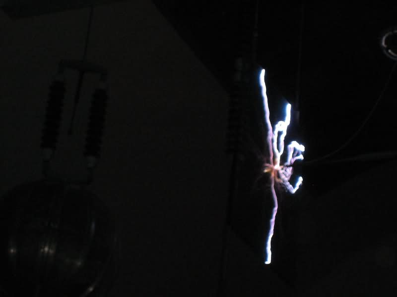
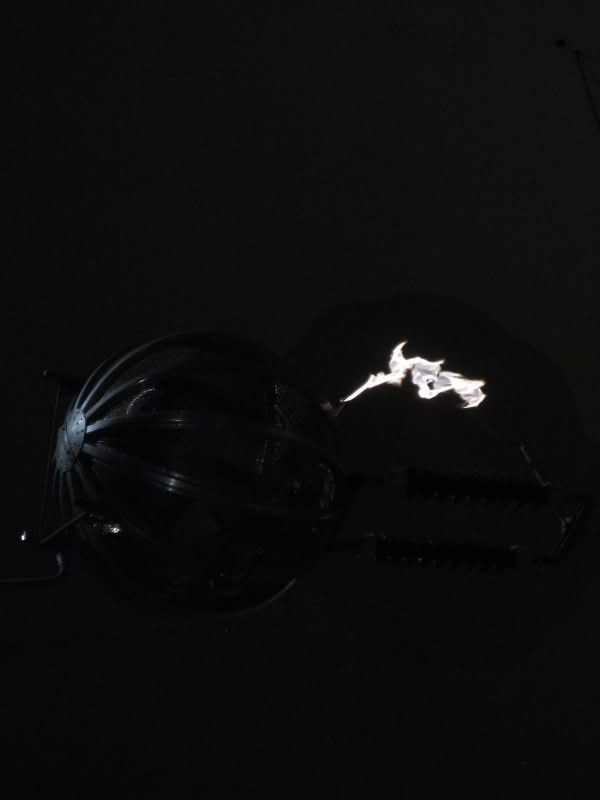
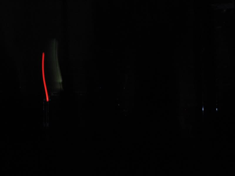
Lightning is defined to be “an atmospheric discharge of electricity, which typically occurs during thunderstormsâ€. A quite abstract technical definition, but does not describe what a lightnings looks alike … and especiallywhat humans think when they see and watch this. Two weeks ago I spend a day in Munique (Germany), and visited the “Deutsche Museum†(a big technical museum). It was indoor, and (only) 50.000 Volts … but a horrible feeling.
I took some pics in the darkness – and was not expecting to get such fascinating pictures, which much more look like art than like “hell”.
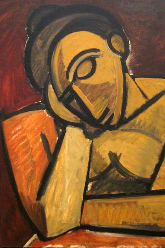
Design is a word of modern world ? Wrong! Design is an experience of culture since humans were able to make a drawing on a stone wall. Picasso invented modern art and design? Wrong again. Have a look yourself.
His creativity was based on something very old, which few people realize. Indeed Picasso had a strong relation to african tribal art, which he loved. And it is astonishing, how close things become.
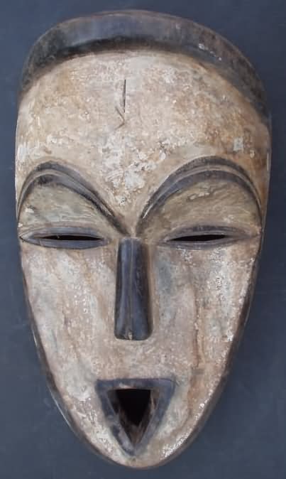
Indeed african tribal art has been very typical for modern design: Very clear expression, simply but strong signs, simply concentration ont he most important items of a face or an object. The african tribes didn´t do that for purpose of art, it was part of their religion. They were wearing african masks during their religious procedures. If you want to learn more about this fascinating peaces of art, pay a visit to a nice collection of african tribal art, which also has a large gallery of african masks and african figures.
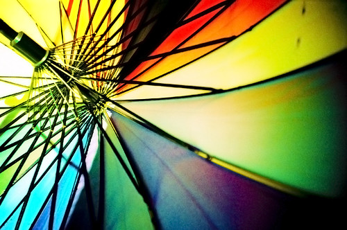
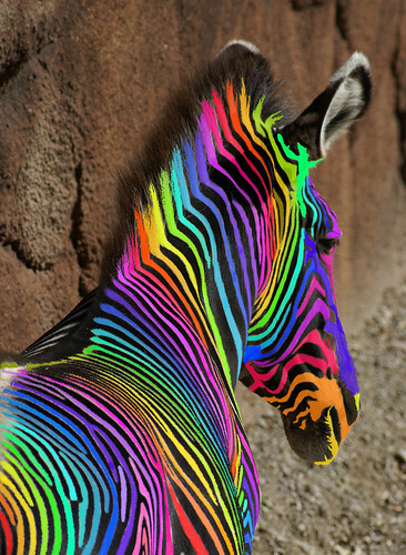
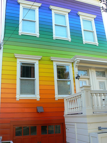
The rainbow is a fascinating work of nature, which inspired designers as well as nature for many colourful and impressing pictures. But have a look yourself to some great pieces of art, enjoy and take some ideas with you! Just to start a nice rainbow …
Obviously a nice combination of “nature” and “art”:
![]() photo credit: Creativity+ Timothy K Hamilton
photo credit: Creativity+ Timothy K Hamilton
Moving away from nature to humanity, the colourful rainbow becomes part of daily life:

![]() photo credit: Glockenblume
photo credit: Glockenblume
![]() photo credit: Octoferret
photo credit: Octoferret
Typography is just not a question of writing different. Indeed it may become a real visual experience. But have a look yourself how simple letters can create an astonishing design. Enjoy these nice pieces of art.
Continue reading “The Art of Typography – making Design a Visual Experience”
These days, in this trendy world, folks get very sensitive when they do not look fully presentable. This would also be the truth in designing their web sites. So when it comes to this work, major emphasis should be paid to every microscopic element to secure it performs optimally to contribute its destination. Here are five important rules to make sure that you or the website design firm perform the work as expected.
Have a plain and recognizable navigation
You have to present a simple and very self-explanatory navigation menu so that even a young child will know what to do. Stay away from complex Flash based menus or multi-tiered dropdown menus. If your visitors don’t know how to navigate and find the stuff they are looking for, they will quit your site.
Do not use Splash pages
Splash pages are the front pages you observe when you pop in at a website. They normally have a very lovely picture with text similar “welcome” or “click here to enter”. In fact they are right like an artificial apple lovely looking with no concrete meaning. or the website owner it might be attractive, espcially the frequent surfer will hate it. And after the 5th visits it becomes boring even for the website owner
Select the optimal Color Schemes, Fonts and Themes
Themes must all of the time accommodate the company or preferably, the organization or owner. If the website was built to cater for a software company, it would be wise to follow that special category, instead of to turning back to a another theme, such as clothing.
Fonts ought be used in respect to the formality of the website. A elementary Helvetica font would do in almost types. Special cases such as design and art groupings might want to use fanciful conceptions and fonts. Of course, that’s only if you know what you’re doing.
Avoid annoying banner advertisements
Okay, most of the websites have to earn some money to bear the costs. But too much is too much. Even the least net experienced persons have accomplished themselves to overpass banner advertisements so you will be wasting precious website space. Instead, provide more valueable text and interweave useful affiliate links into your content, and let your visitors feel that they want to buy instead of being pushed to buy.
Forget using extensive audio/video on your standard pages
If your visitor is going to stay a expanded moment at your site, reading your topic, you will want to make sure they hey are not annoyed by some audio looping on your website, or a video taking hours to load despite having a good web hosting. If you insist on adding audio or video, make sure they have some control over it, volume or muting controls in case of audio and a STOP-button in case of video would work fine.